
01 / BACKGROUND
Reframing success.
Founded in 1983, Annex Pro has grown to become a leading value-added reseller for the media and entertainment industry. With expertise in hardware, software, and service, Annex Pro provides solutions to thousands of customers in the animation, visual effects, immersive tech, and digital media sectors.
With offices in Vancouver, Montreal, Toronto, and Los Angeles, and a large roster of industry partners including Autodesk, Avid, Wacom, Lenovo, EIZO, Dolby, and Qumulo, Annex Pro continues to focus on leading the industry and setting the standards on value-added services, technical support, and flexible financing options tailored for the media content creation industry.

02 / CHALLENGE
Design — To re-envision and design a visual identity that connects with Annex Pro’s audience and upholds the company’s brand promise. The new visual identity was required to reflect the company’s technology-forward approach, to stand out from the crowd, and support the company’s vision for growth in the industry.
03 / AUDIENCE
B2B and B2C; professionals in the VFX, music, game development, broadcast, pre-production and post-production industries.
Strategy
Discovery + Exploration
Creative Direction
Competitive Analysis
Brand Voice + Tone
Key Messaging
Design
Logo
Visual Identity Systems
Custom Logotype
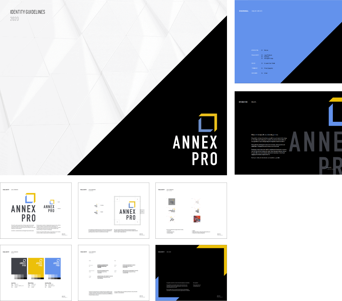
Brand Guidelines
Collateral Material
Grids and Templates
Signage
Advertising
Photosourcing
Content
Brandstory
Copywriting
04 / SOLUTION
It takes bravery and trust to embark on a rebrand after 30 years.
We take that seriously.
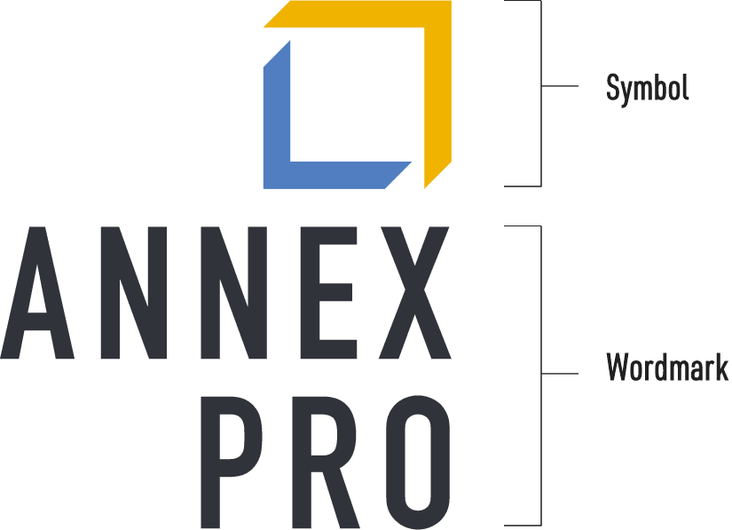
The new symbol embodied the act of framing a subject with one’s hands, a classic gesture used by artists and directors when setting up a scene. The execution of the symbol presents authority and precision, analogous to similar digital counterparts in creative production.
In this, there is a connection between a merging of the past with the present.
The frame symbol is a depiction of a highly stylized double-story “a” (do you see it?) and is a reflective of modern art galleries or museums design language with a similar curated aesthetic. This aspect symbolizes and carries a respect for the artistry and craftsmanship of Annex Pro’s clientele. As a graphic element, the linework can be used in patterns and additional visual elements offering a flexible and ever expansive visual language.
The typeface for the wordmark we selected is DIN, commanding and emanating a strong architectural feel. The letters are tall and confident, reaffirming a sense of knowledge and trust.
Before
After
05 / PRIMARY IDENTITY
06 / COLOUR
Mikado Yellow
RGB: 236, 195, 11
CMYK: 0, 17, 95, 7
HEX: ecc30b
Cornflower Blue
RGB: 100, 149, 273
CMYK: 58.59, 36.79, 0, 0
HEX: 6495ed
Annex Grey
RGB: 65, 67, 73
CMYK: 70.7, 62.11, 53.91, 41.41
HEX: 414349
09 / TYPOGRAPHY

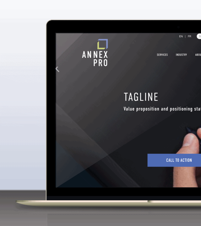
Web





Let’s talk
Now that you know about us,
let’s talk about you.
GOOD Design is
GOOD for everyone.
Helping uncover your potential through insightful design and effective communications, together.
Cullimore Creative Inc.
Railtown Design District
Vancouver, BC